Calastone
Minimum Viable Products for Institutional Investors


project featured on
How the Design System Empowered the Sales Team
Calastone, the largest global funds network, aims to revolutionize the funds industry by automating and digitalizing the global investment funds marketplace. With over 4,000 clients in 55 countries, the company processes £250 billion of investment value each month.
Despite having a functioning product, Calastone’s CTO recognised the importance of gaining a fresh perspective and expertise in order to develop a new design system. Our role was to effectively present substantial financial data in a manner that was both easy to read and user-friendly.
SERVICES
- Digital Product Design
- UI Revamp
- UX Design
- Web Application
- Mobile Application
INDUSTRY
- Finance
SEE LIVE
Calastone didn’t have any product design culture or a design system to support it.
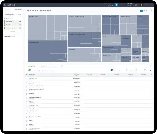
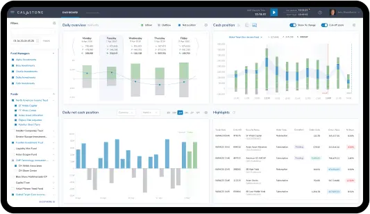
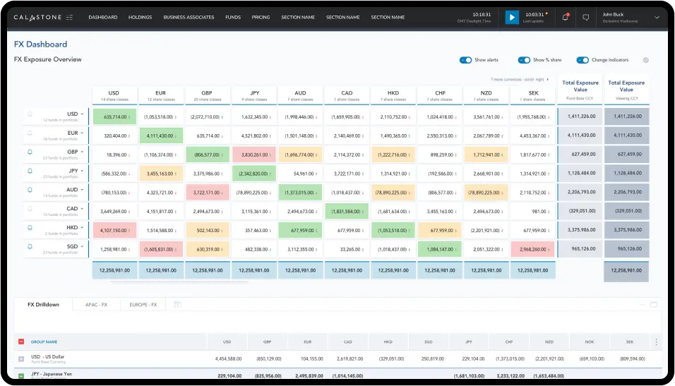
The company's system, while technically advanced and capable of accessing vast amounts of financial data, failed to present the information in a user-friendly manner.
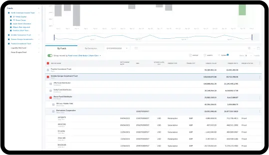
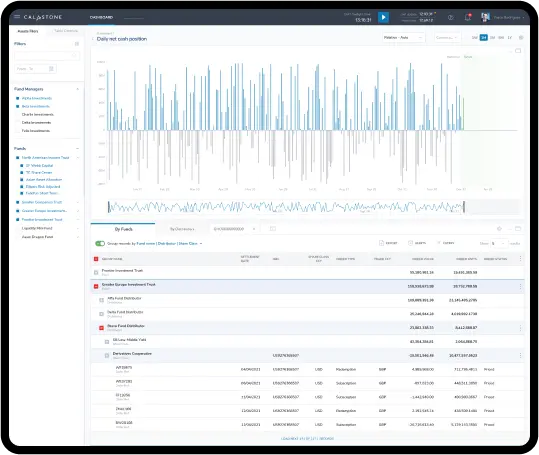
It was necessary for us to create an optimal method for integrating tabular data with charts.
Calastone needed a consistent visual appearance for all of their products (the next phase of our cooperation).
Conducting an audit of the Calastone system.
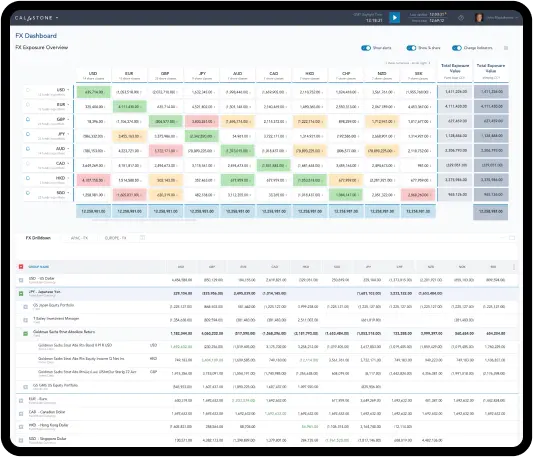
Designing user flows and visuals for multi-level financial data.
Adapting the new design system to Calastone’s business goals.
Incorporating designing and developing standards for future Calastone’s systems.
Creating a custom table chart tailored to meet the specific requirements of Calastone.
Scope of work
The initial phase of the project involved evaluating Calastone's existing system. As an external party, we were able to offer a fresh perspective and consider the visual challenges posed by the system.
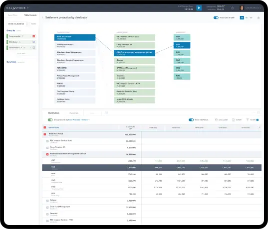
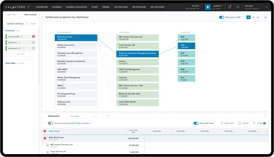
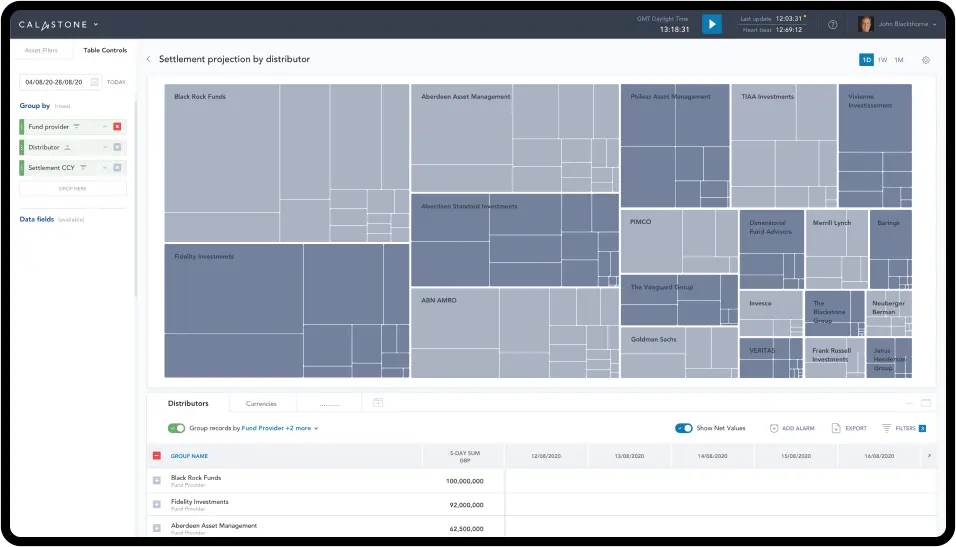
Subsequently, we proceeded to create user-flows, charts, and tables to effectively visualise all financial data within the system.
While working on the project, we realised that Calastone had precise requirements for displaying financial parameters. In response, we developed a multi-level table that allowed combining data from various pivot tables, facilitating analysis and correlation.
Based on the new design system, we proposed design and development standards for future Calastone products.
How Did We Design Visuals for Multi-Level Financial Data?
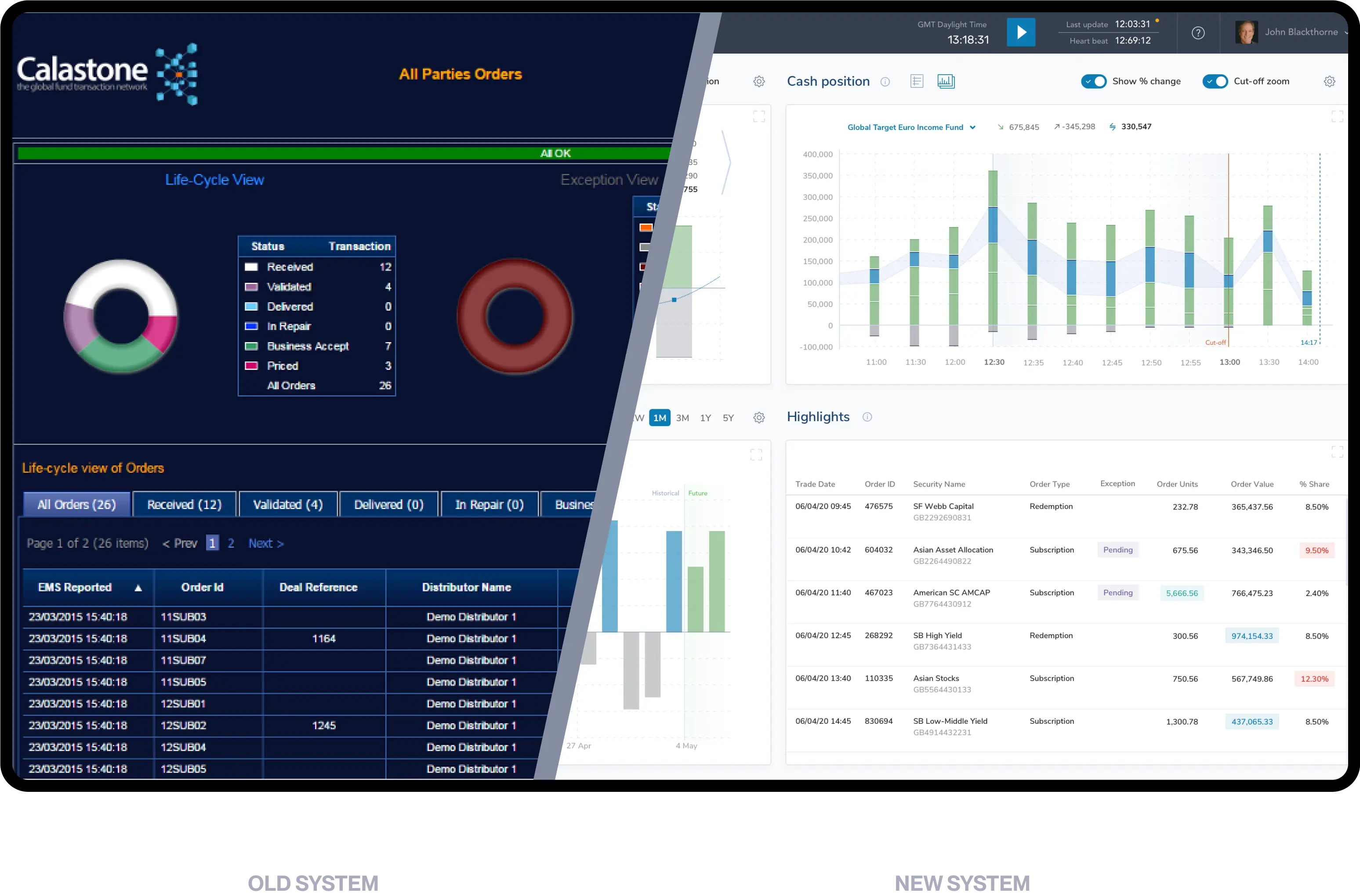
Navigating the old system was complicated. There were no visuals to back up the data.
Moreover, the analysis of the data was complex for the same reason. We had to understand and then design all user flows to draw visuals for the financial information effectively.
The Starting Point
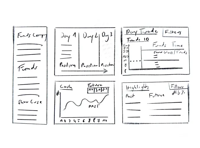
During the initial meetings and system analysis, discussions with Calastone revolved around their visual concepts. We received sketches and were tasked with adapting them to fulfil the specific requirements for presenting financial data.
User Flow and Wireframes
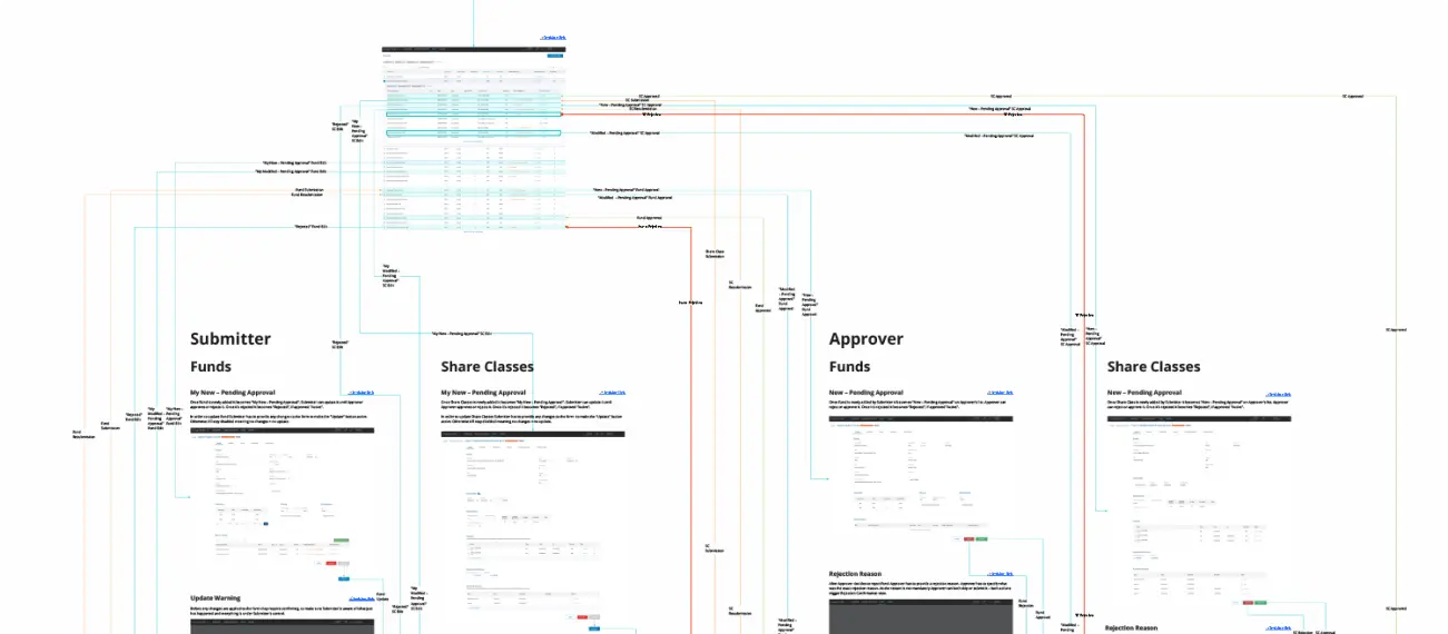
Building and brainstorming over the prototype prototype was essential in early validation of the MVP assumptions and enabled us to pivot new ideas without spending client’s money and time on building the real product.
Colours and Typography
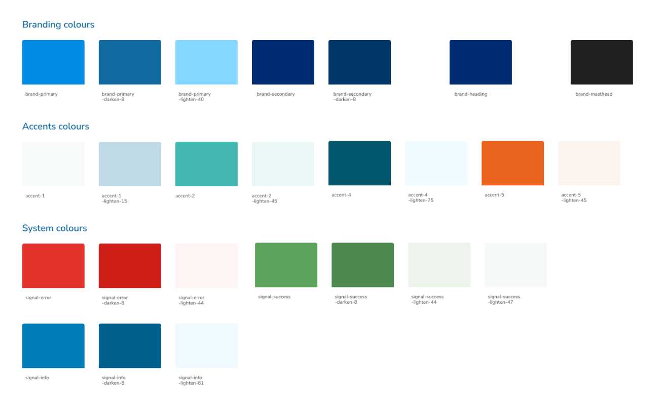
Colors
Form Fields

Buttons

White-Labeling
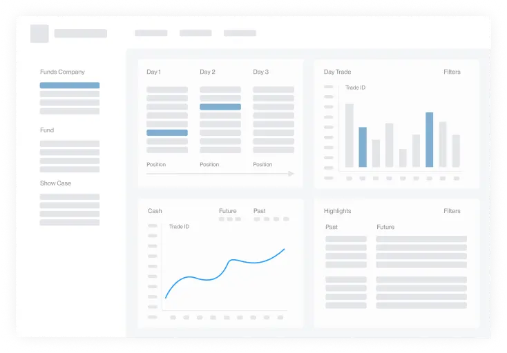
As Calastone translates various financial transactions for different clients worldwide, it was essential to incorporate franchising and white-labelling features.
We designed a demo to check if we aligned with Calastone’s needs. We could go through all functionalities and implement changes before the development work.
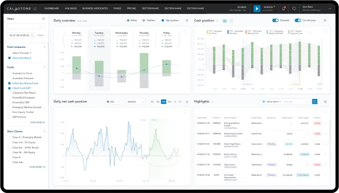
Fast-Changing Financial Data
Users were enabled to click "pause" to analyse the rapidly changing data. This feature supported performance, but at the same time, generated Excel reports were based on slightly outdated information because the numbers were changing every second.
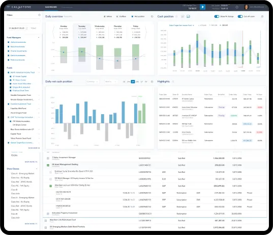
The solution to this problem was to enhance existing products with a new one that allows real-time monitoring of aggregated data, which, due to aggregation, wasn't as overwhelming and changed relatively slowly.
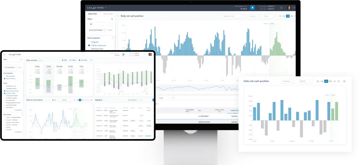
Our task was to design charts that could effectively display this dynamic information clearly and comprehensively.
“They are authentic and always go above and beyond to deliver for us”.
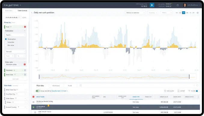
Animated Charts and User Statistics
The system was enhanced with new features that enabled the tracking of user statistics, and all charts were animated to visualise the financial data effectively.
Additionally, the system's navigation was streamlined, making it less burdensome to work with the data and eliminating the draining hours spent on data analysis.
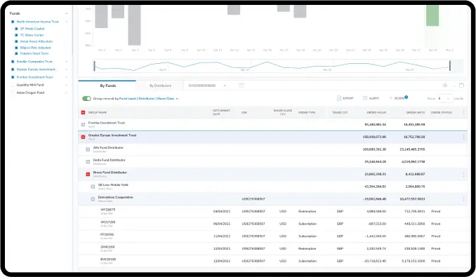
The Outcome of Our Work
The development of a new design system enhanced user-friendliness. It also allowed complex batches of data to become readable and, thanks to visuals - easier to analyse.
Additionally, it provided a more accessible presentation. The sales team found showcasing the system's features effortless, making the selling process smoother.
Thanks to our changes in the Calastone’s initial product, it was easier to develop ideas and incorporate new products.
Delivering the Best Possible Desktop Experience
As Calastone didn’t require a mobile version of their system, we concentrated on optimizing the desktop experience.
Institutional Users don’t use the mobile version - the financial data is too complex to be analysed appropriately on the small screen. We decided with Calastone that the desktop version was the only one they needed. This approach enabled us to focus on using the desktop space in a better way to adjust to the fact that all screens won’t have to be designed as mobile versions. It saved our time and the client's money.
