Equinity
Complaints Management Solution Revamp
project featured on
How the New System Led to Significant Performance Boost
Equnity provides expert shareholder, pension and remediation services to corporate clients around the world.
Their team asked us to help reinvent their compliant system, which didn't meet market standards and was causing problems for its users. The company noticed an efficiency drop, and due to the old and unintuitive design, Equnity also had difficulty selling the system to prospects. It was high time for some changes.
SERVICES
- Digital Product Creation
- UI Revamp
- UX Design
- Product Management
- Web Application
INDUSTRY
- Fintech
Website
A short timeline to deliver a fully operational platform that changes UX.
Chinese characters & loads of data as a UX/UI challenge - readability on all devices using the same templates.
Translating intricate reports, portfolios, and risk assessment tools into a mobile-friendly format, all while maintaining a seamless user experience.
Creating a simple, yet compelling product that would boost sales of complex J.P. Morgan retail offerings.
At launch the initial release had to offer functionality on all devices and be available in English, Traditional and Simplified Chinese.
Cooperation with an in-house development team & frictionless hand over jeopardize corporate security standards.
Discovering and naming all the dependencies.
Delivering a product that effectively minimizes the drop-off rate.
Scope of work
The need for revamping arose as the company’s Digital Marketing Department observed a significant demographic shift in their client base, leaning toward a younger generation. These new-age investors were more mobile-oriented, contrasting with the platform's complexity and traditional desktop approach.
Our most significant challenge was to accurately map the process, optimise it, and deliver a fully functional product within a 4-month timeline.
The second objective that presented a challenge was to build responsive tables that could exhibit a similar amount of multi-level data and options as the desktop version.At the same time, we had to develop a version of the product that functions flawlessly and provides an optimal user experience for both English and Chinese-speaking users.
How Did We Create User
& Manager Friendly System?
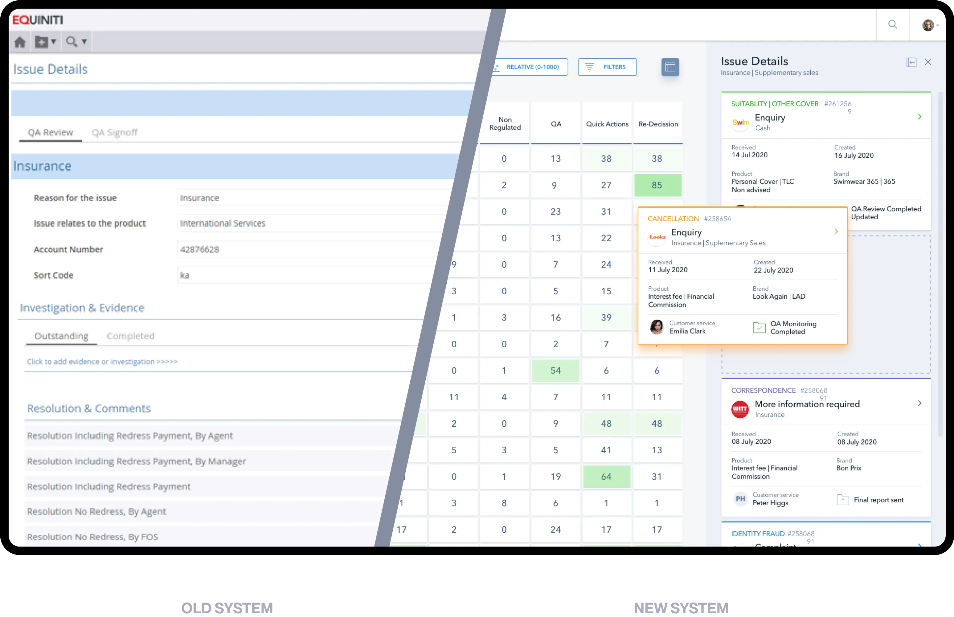
The previous system did not meet the market standards and made it impossible for users to complete tasks efficiently within a single tab.
We revamped an existing product integrated on the corporate scale in many leading companies.
The new system was designed by our team in collaboration with the Equnity team and a focus group consisting of active system users.
Old System Review
We performed UI (User Interface) and UX (User Experience) audits and mapped all processes within the system to optimise them later. We also identified the most significant performance issues and started to design solutions that would save users’ time and ease the management of bottlenecks in a visually appealing way.
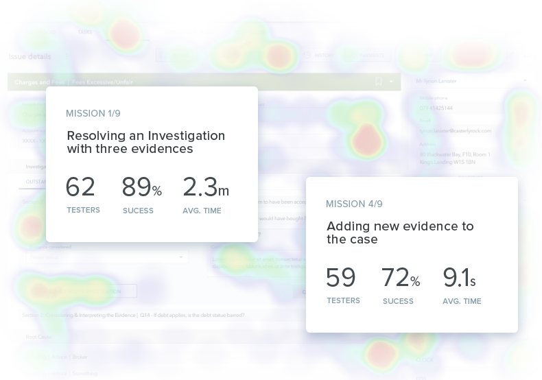
Testing on Real Product
with Heatmap
Based on our discoveries, we developed an early prototype, analyzed users’ behaviour and then optimised UI to improve the process.
We also focused on eliminating human error, which is highly unacceptable in the case of the FSA (Financial Services Authority) compliance complaint.
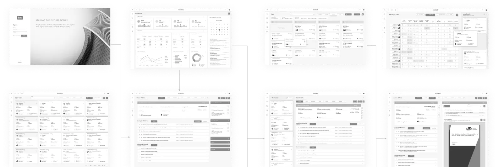
User Flow and Wireframes
Building and brainstorming over the prototype prototype was essential in early validation of the MVP assumptions and enabled us to pivot new ideas without spending client’s money and time on building the real product.
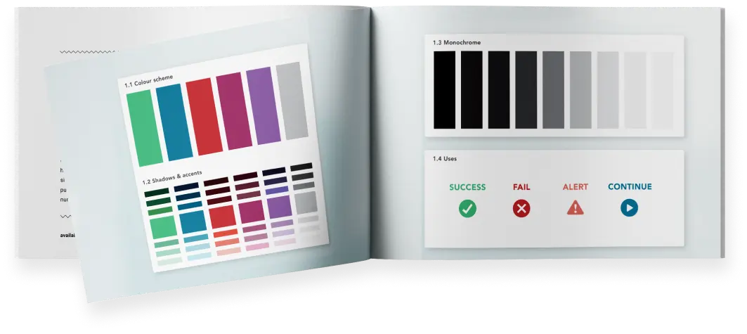
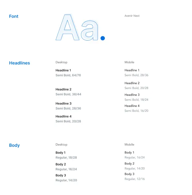
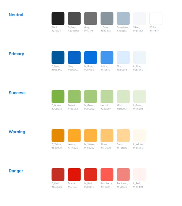
Colours and Typography
Old brandbook
New Design System
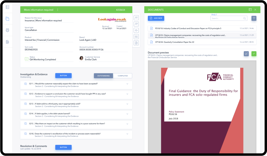
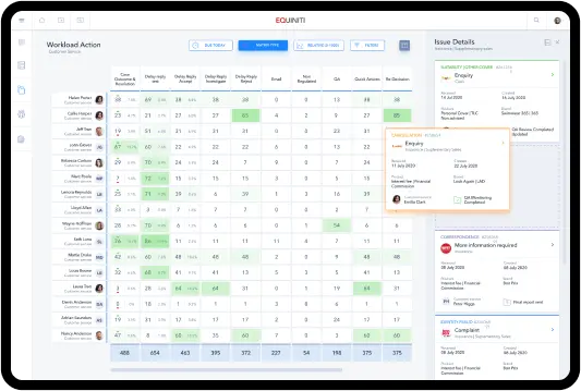
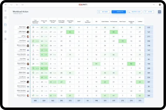
Workload Preview
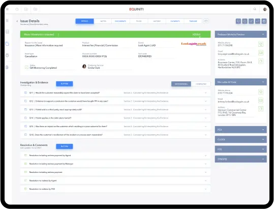
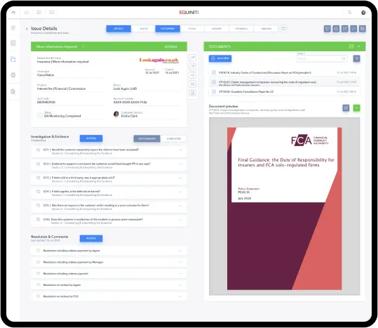
One-stop-shop with all the information the user needs
Pulling information from different, hidden folders and going back and forth between tabs can be frustrating and time-consuming - that was our starting point. We knew we had to simplify the process.**
One of our tasks was to create a platform that could be used for 8 hours a day and wouldn’t make the user frustrated. All the information about the product and clients had to be in one place. Also, the user had to have access to regulations needed to solve a case.
“Their work was solid and we were blown away by their abilities to use the most modern, cutting-edge technology. They have the ability to create impressive, dynamic work”.
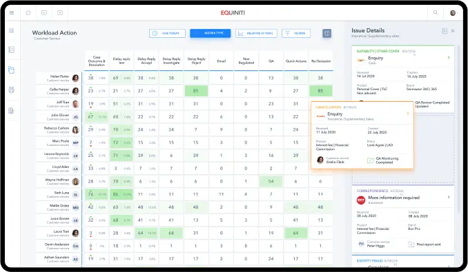
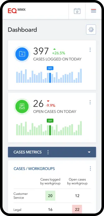
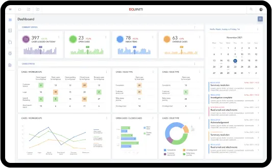
Intuitive Dashboard Statistics
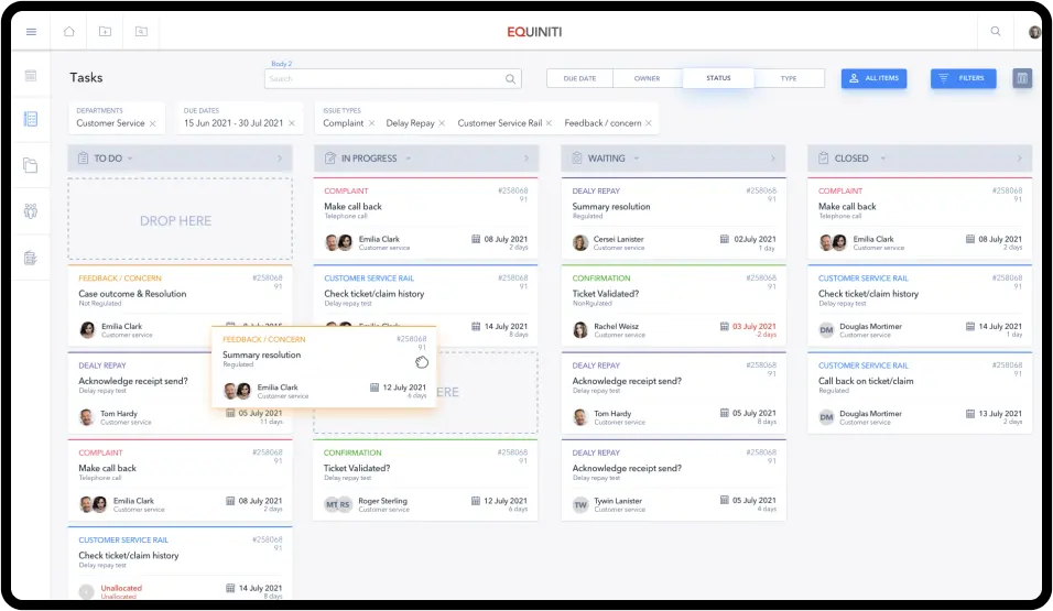
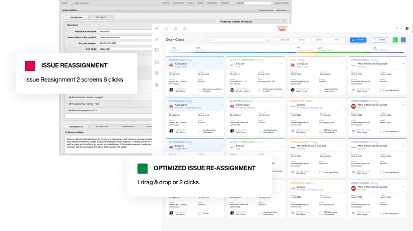
The creation of the project dashboard provided managers with an easy way to control workload. The simple drag-and-drop feature allows organizing work, ensuring that everyone in the team has an equal number of tasks.
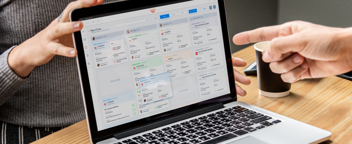
Screens Designed
Hours of Design
More Clients on the new website
Wireframes & User Flows
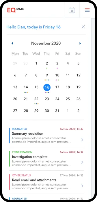
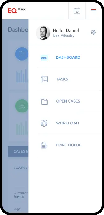
From big screens to small, the platform is designed to look great everywhere
Performance is all about facilitation and quick access
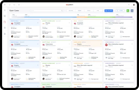
The final product allows all users to effectively manage their tasks. Through the use of colour coding and labelling, all information is easily readable and manageable, enabling users to complete tasks efficiently. The need to copy and paste data or switch between multiple tabs was eliminated, as everything is conveniently located in one place.
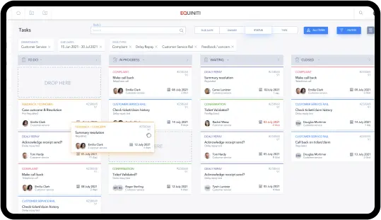
Mobile Access to Workload Wherever You Are
