J.P Morgan eTrading
Responsive Web Application for Retail Investors
project featured on
How New Features Increased Sales Conversion
J.P. Morgan is a global leader in financial services, offering solutions to the world's most important corporations, governments and institutions in more than 100 countries.
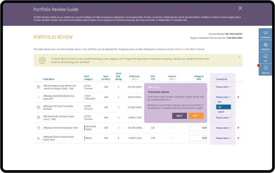
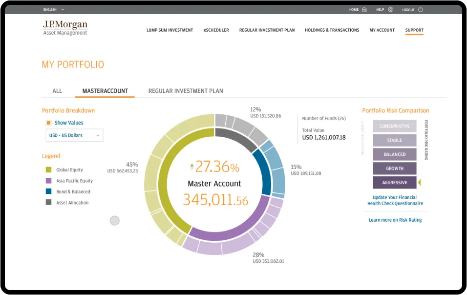
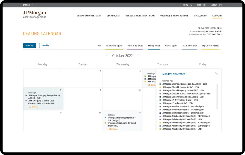
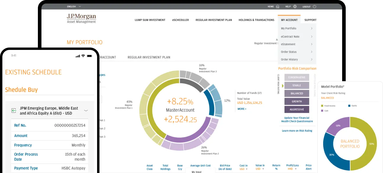
We were approached by the company to breathe new life into their eTrading platform - an aging but comprehensive web-based tool, offering over 300 investment funds and a wide array of other financial instruments for retail investors... The platform enables not just regular trading but also facilitates scheduled transactions, making it a one-stop destination for users. It provides all the necessary resources to monitor and manage investment portfolios, verify transactions, and assess risk levels effectively. The J.P. Morgan Asset Management Hong Kong & JPM Digital Marketing Department approached us with a request to assist in developing a solution aimed at boosting the company's sales.
Services
- Digital Product Creation
- UX Revamp
- Product Development
- Sales Support
Industry
- Finance
See live
A short timeline to deliver a fully operational platform that changes UX.
Chinese characters & loads of data as a UX/UI challenge - readability on all devices using the same templates.
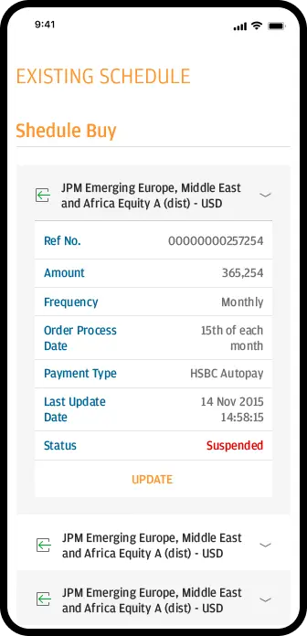
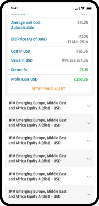
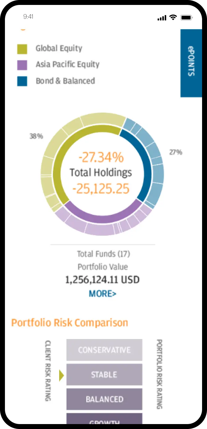
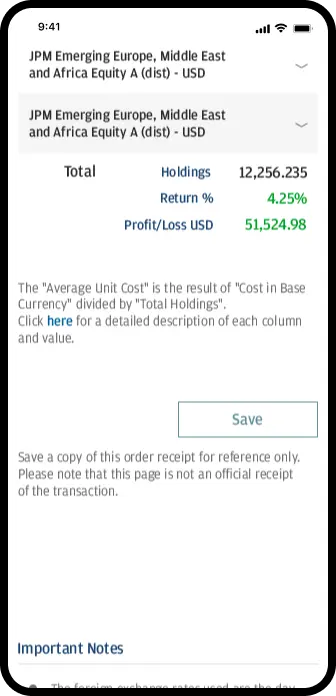
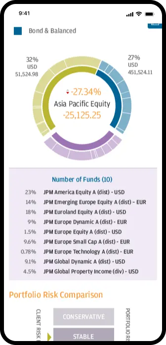
Translating intricate reports, portfolios, and risk assessment tools into a mobile-friendly format, all while maintaining a seamless user experience.
Creating a simple, yet compelling product that would boost sales of complex J.P. Morgan retail offerings.
At launch the initial release had to offer functionality on all devices and be available in English, Traditional and Simplified Chinese.
Cooperation with an in-house development team & frictionless hand over jeopardize corporate security standards.
Discovering and naming all the dependencies.
Delivering a product that effectively minimizes the drop-off rate
Scope of work
The need for revamping arose as the company’s Digital Marketing Department observed a significant demographic shift in their client base, leaning toward a younger generation. These new-age investors were more mobile-oriented, contrasting with the platform's complexity and traditional desktop approach.
Our most significant challenge was to accurately map the process, optimise it, and deliver a fully functional product within a 4-month timeline.
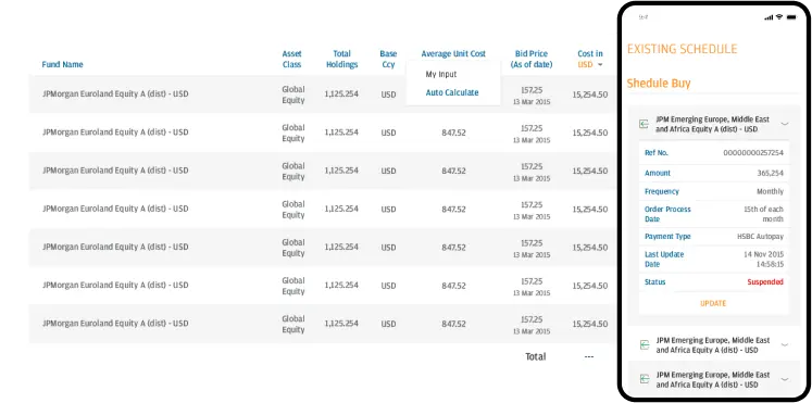
The second objective that presented a challenge was to build responsive tables that could exhibit a similar amount of multi-level data and options as the desktop version.
At the same time, we had to develop a version of the product that functions flawlessly and provides an optimal user experience for both English and Chinese-speaking users.
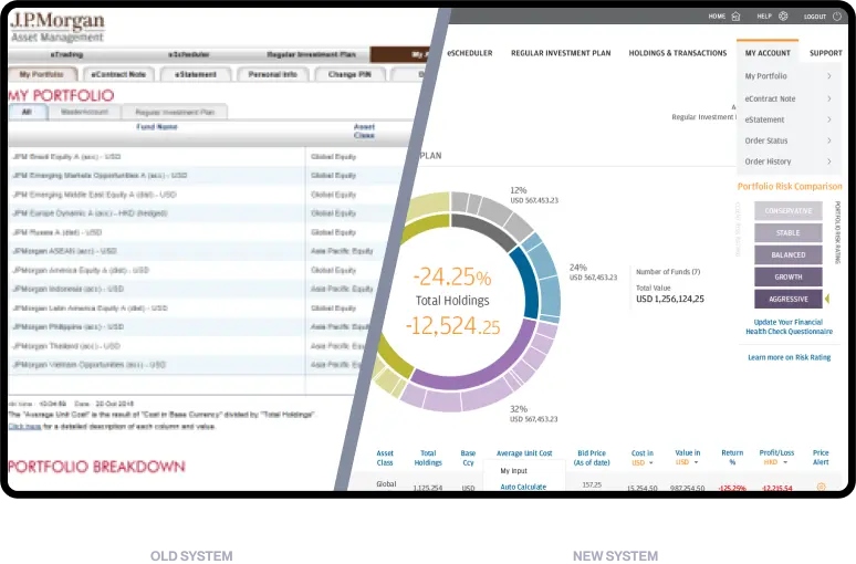
How Did We Change the Visual Side of Numbers?
The eTrading app has progressed through all innovation stages in just four months—from prototype and MVP to a full-featured product that increased sales.
Through close cooperation with the client, rapid prototyping, pivoting, and early validation, our designers crafted the ideal solution that offers a seamless experience across both desktop computers and mobile devices.
The Process Behind Product Creation
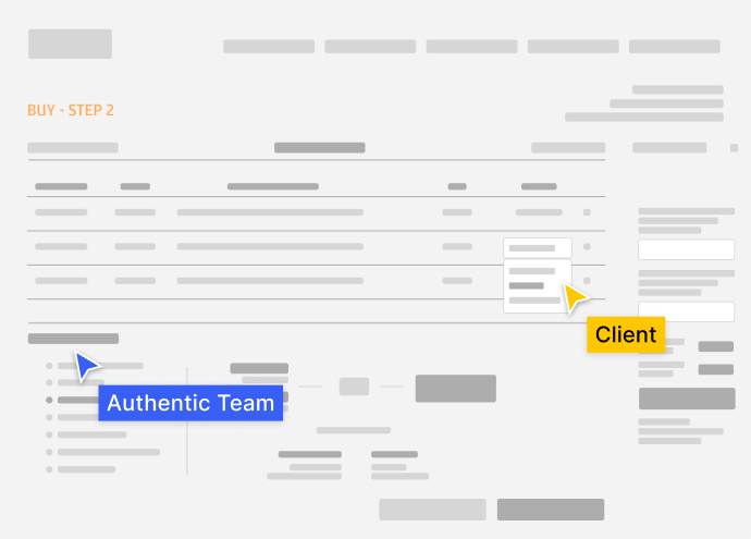
A/B Tests with Users
for Better UX
A/B testing during the planning stage to validate hypotheses that either come from stakeholders or result from usability tests. A/B tests are among the most potent ways to improve Key Performance Indicators (KPIs).
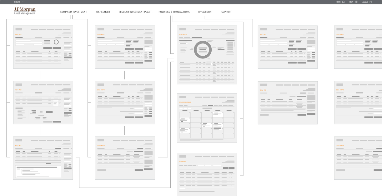
User Flow & Wireframes
Revamping a product often means creating something from scratch with specific data. That’s why it’s so important to create a well-designed information architecture at the very beginning. Building and brainstorming over the prototype was essential in validating earlier MVP assumptions and enabled us to pivot to new ideas without spending the client’s money and time on building the real product.
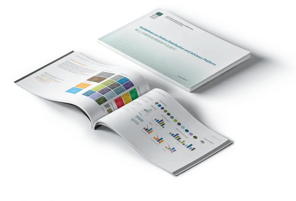
Colours and Typography

“We’ve had a long-lasting partnership with Authentic Digital. They always try to make things possible. Even though we don’t see each other on a daily basis, they feel like part of our internal team”.
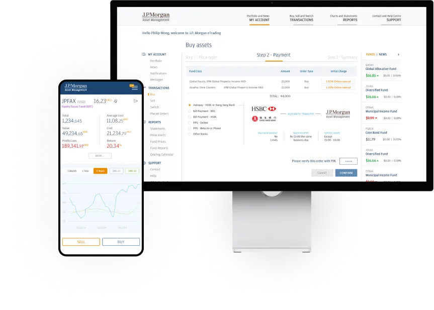
Financial Data Solutions
J.P. Morgan faced a high drop-off rate on their website. Our objective was to create a platform enabling users to quickly access all the required information while ensuring the data is easily readable.
Engaging All Users
By analyzing the results of A/B tests, we were able to design the optimal experience for every user, including the younger generation that tends to prioritize mobile usage.
Screens Designed
Hours of Design
More Clients on the new website
Month timeframe
From big screens to small, the system is designed to look great everywhere.
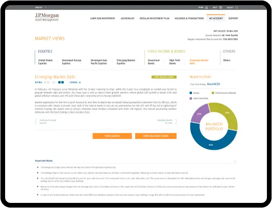
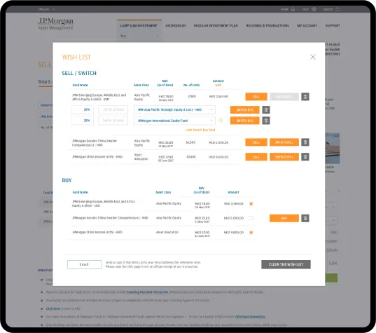
Without diving into technicalities, imagine lots of in-depth information - charts, numbers, sentences on a big screen and then convert them to a tiny phone screen. Sounds impossible? But we did it.
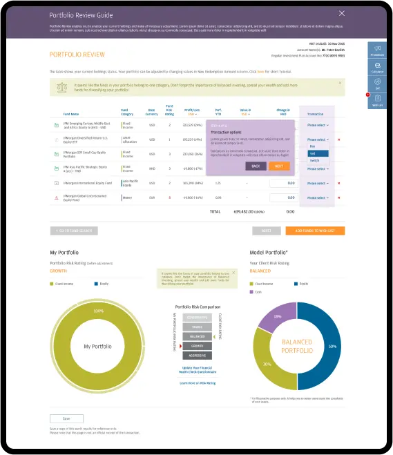
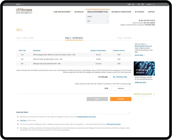
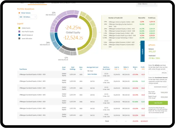
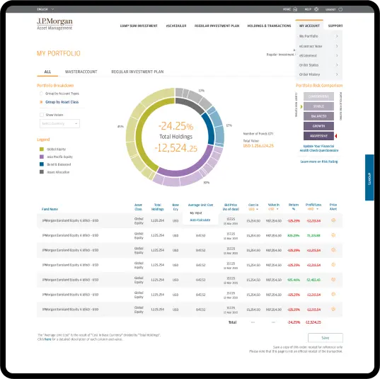
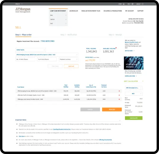
Seamless Mobile Experience
It’s one stop destination that gives users access to every resource they need to fully monitor and mange their portfolio positions, check transactions and evaluate risk levels wherever they are.
