Snap-On
Revamping Financial Reporting for Global Auto
Distributors
USED BY
PROJECT INTRODUCTION
How redesigned data visuals helped Snap-on win over Nissan
Snap-on, a provider of professional services and solutions for car manufacturers.
Snap-on Business Solutions approached us to elevate their OEM dealer network system — a data-rich platform that struggled to communicate insights effectively.
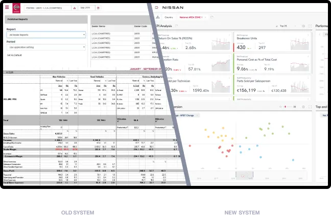
Though the system housed valuable sales data, users were often unable to interpret it or draw actionable conclusions. Its outdated visuals and vague presentation of sales data made it hard for car dealers to compare performance or draw meaningful conclusions.
Our goal was to redesign the system’s interface and data visuals to make insights instantly clear and actionable — a transformation that helped Snap-on successfully pitch the platform to Nissan
Services
- Digital Product Creation
- UX Revamp
- Product Development
- Sales Support
INDUSTRY
- Automotive
SEE LIVE
Challenges
Unclear Data Presentation – users couldn’t interpret or act on the existing sales data.
Outdated Visuals – the system looked generic and failed to stand out in a competitive market.
Low Sales Engagement – Snap-on’s sales team struggled to convince clients of the system’s value.
Goals
Improvement of Data Readability – transforming complex metrics into clear, actionable visuals.
Boosting Sales Appeal – creating a more polished, modern interface that supports Snap-on’s pitch.c
Empowering Dealers – enabling performance comparison and insights through smarter tools and filters.
what we delivered?
Scope of Work
The initiative was driven by Snap-on’s sales teams, who found it increasingly difficult to sell the platform to OEM clients.
Despite its powerful backend, the system’s outdated design and unclear data presentation made it hard to differentiate from competitors — and nearly impossible for car dealers to extract value from the insights provided.
Our main challenge was to overhaul the user experience and redesign the data visuals to support better storytelling and clearer comparisons.
At the same time, we needed to maintain the system’s technical integrity and ensure it remained fully compatible with Snap-on’s OEM infrastructure.
project overview
How did we change
the visual side of data?
To redesign the visual layer of Snap-on’s data, we started with a deep dive into how car dealers and sales teams interacted with the platform.
We rapidly prototyped new dashboards, focusing on clarity & data comparison. Through iterative testing and close collaboration with the client, we transformed vague, hard-to-read metrics into a clean, modern interface that highlights key performance insights at a glance.
The result was a scalable design system that not only elevated the user experience but also strengthened Snap-on’s sales narrative when presenting the platform to major automotive clients.
workshops
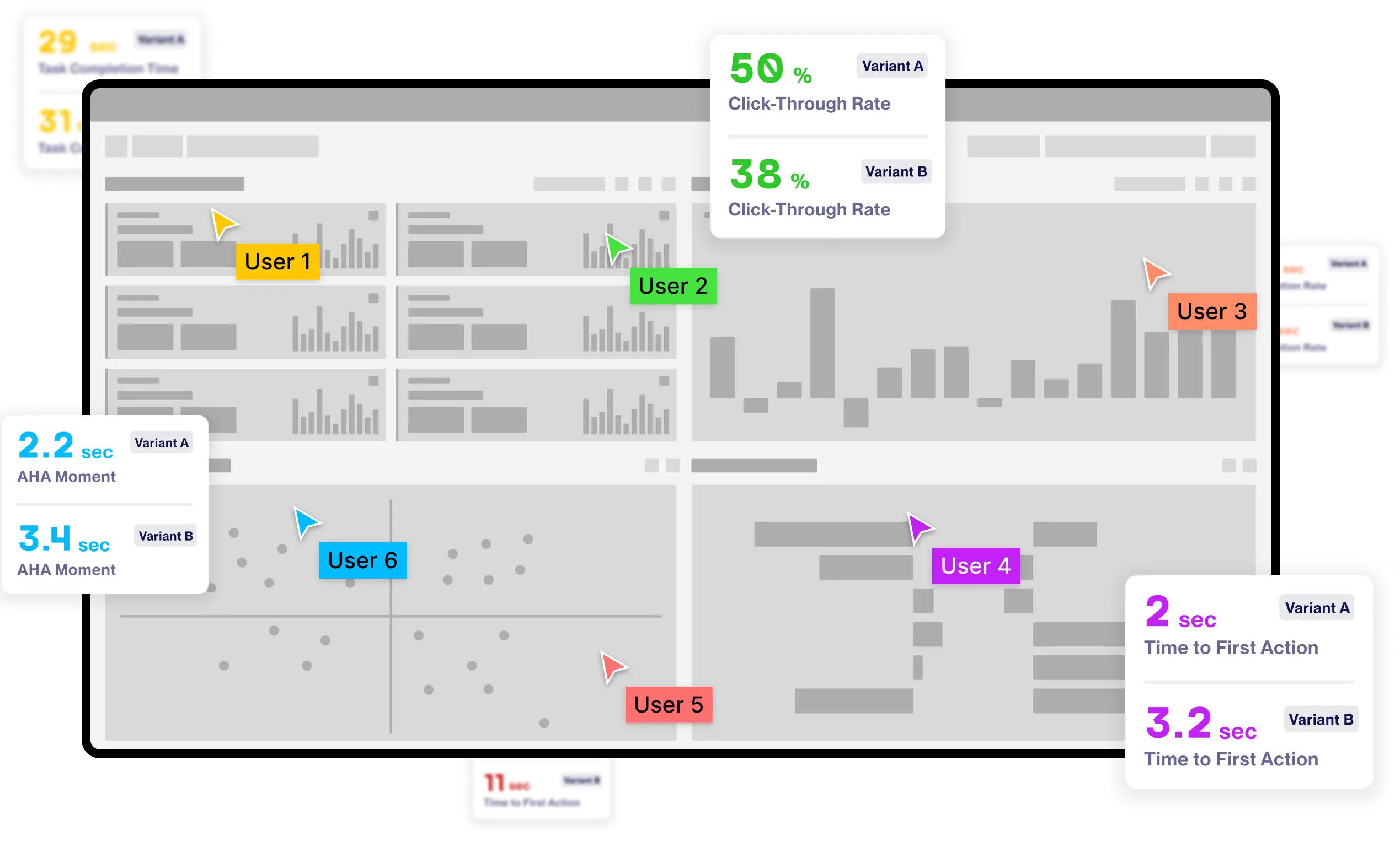
A/B Tests with Users for Better UX
To ensure our design improvements were grounded in real user needs, we conducted A/B tests with selected users from the dealer network. By comparing multiple versions of key screens and dashboards, we gathered insights on clarity, usability, and engagement. These tests played a crucial role in refining the interface and confirming that our visual changes translated into a smoother, more intuitive user experience.
product creation
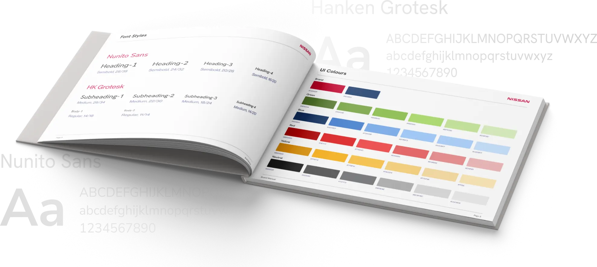
Colours and Typography
product page
Highlights from the Redesigned Visual System

Proof of concept
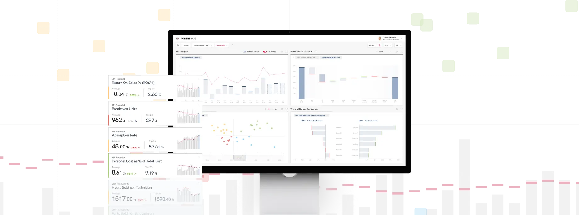
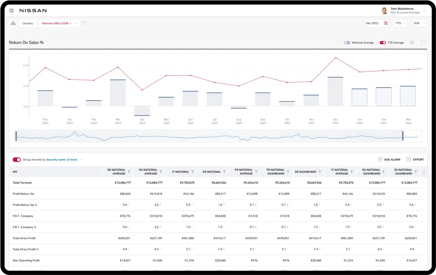
Performance Benchmark Table
This table displays sales numbers and trends across the entire dealer network, enabling each dealership to benchmark their performance, identify top performers, and uncover opportunities for peer-to-peer learning and collaboration.
Proof of concept
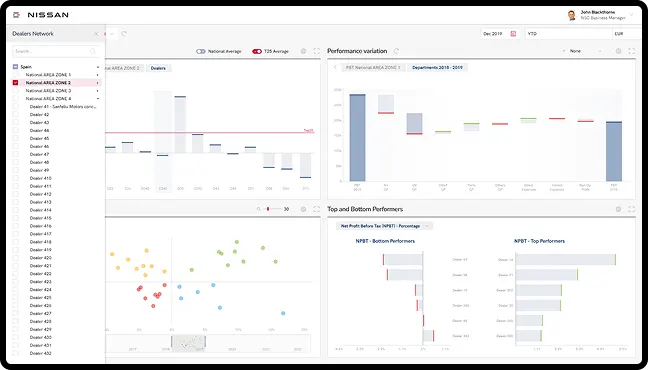
Easy-to-Read Charts
We focused on creating clean, easy-to-read charts that made complex sales data instantly understandable and visually comparable across dealer networks.
Proof of concept
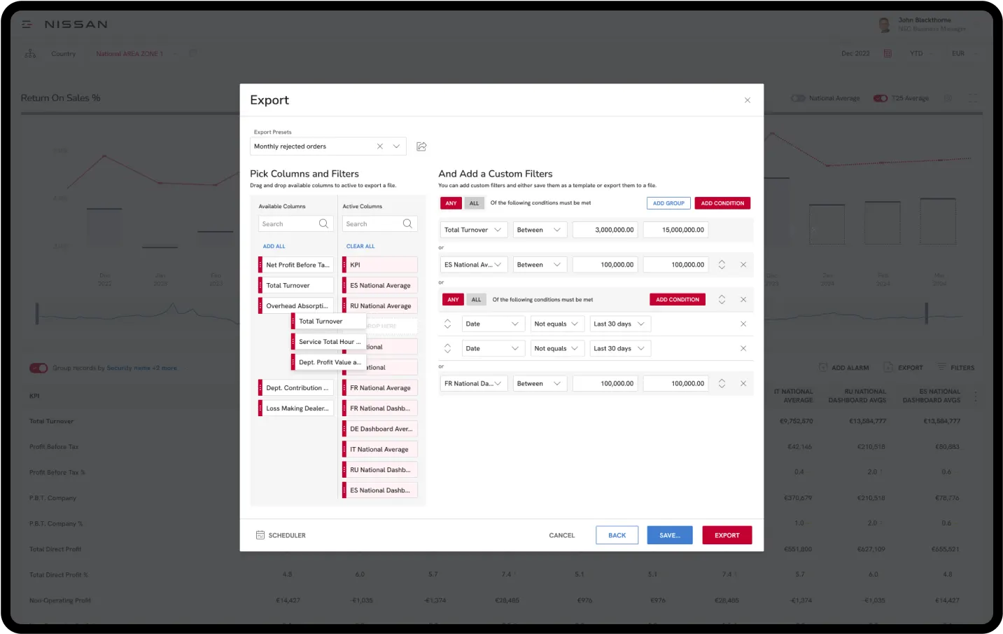
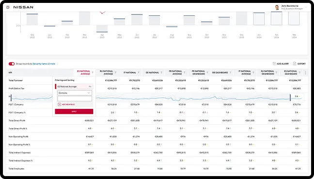
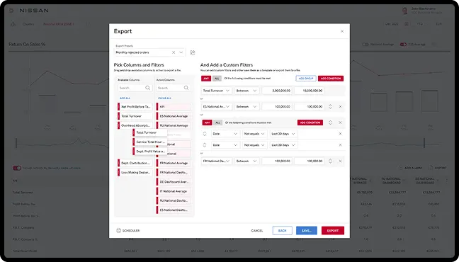
Custom Filters
We introduced custom filtering options, allowing users to tailor the data view
to their specific needs and compare performance metrics more effectively.
Screens Designed
Hours of Design
More Clients on the new Website
Month Timeframe