
Expert Landing Page Development
for Asset Management
So, how is it supposed to be build a landing page that increases retail distribution?
Let us guide you through the digital transformation process. We promise it will be a great experience with an outcome your superiors will thank you for!
We support global leaders
A Good Landing Page Increases Retail Distribution
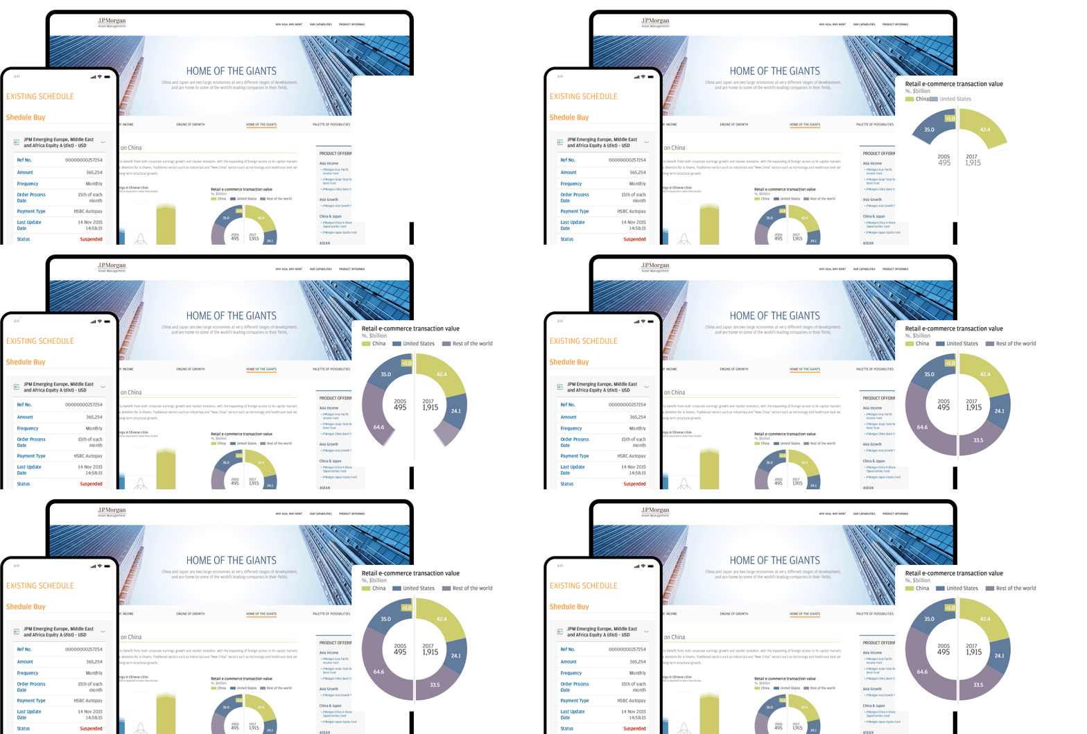
Landing Page Audit
First, we need to assess the current situation. We evaluate what needs to be changed, check components, and talk to the client about the goals. The most important goal is to create a landing page that serves its purpose—sells.
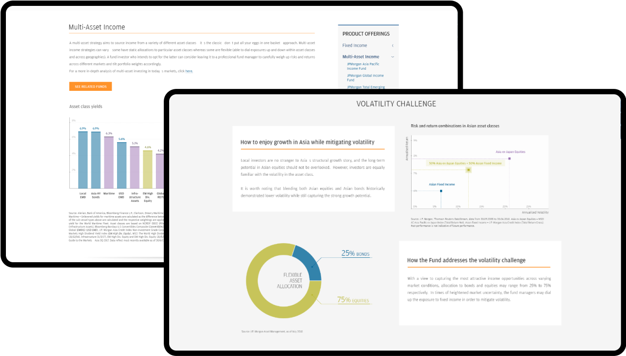
Data Analysis
This stage focuses on the data and information that underlies your landing page. By analyzing the user's journey and identifying areas on the landing page that receive the most attention, we can determine which aspects need to be modified. These insights provide valuable guidance on areas for improvement, allowing the designers to address the actual needs of the users.
Implementation
With all the essential information in hand, we can proceed to design a new landing page for you. This design won't focus solely on aesthetics; it will also cater to your clients' needs, making it easier for them to purchase your product or reach out to you with any inquiries.
“We’ve had a long-lasting partnership with Authentic Digital. They always try to make things possible. Even though we don’t see each other on a daily basis, they feel like part of our internal team”.
Scope of work
Project mentioned by
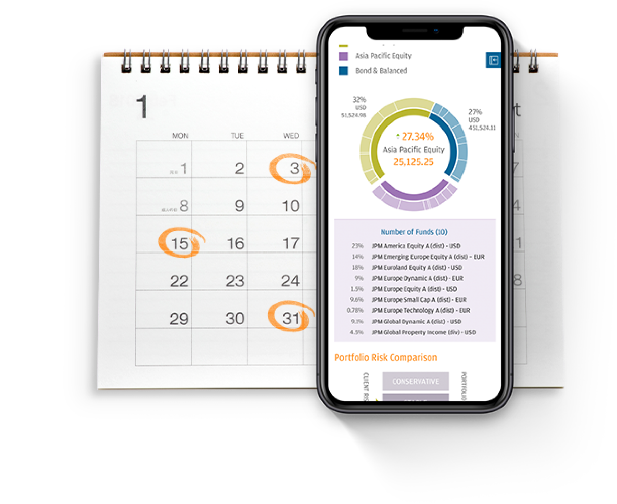
How new features increased sales conversion
A well-crafted user interface can demystify the intricate market of mutual funds, providing clarity and ease for users. This supports confident decisions, boosting user engagement and significantly enhancing sales conversion rates - precisely what the Digital Department had to achieve.
Explain why the prospect should choose your Asset Management
We have helped many Asset Management companies create landing pages to support their growth and sales. The key is building the page in a way that is compelling for a user and also looks professional. Good content is only half of the success; you also need a page that is easy to navigate and guides your prospect to the sales funnel.

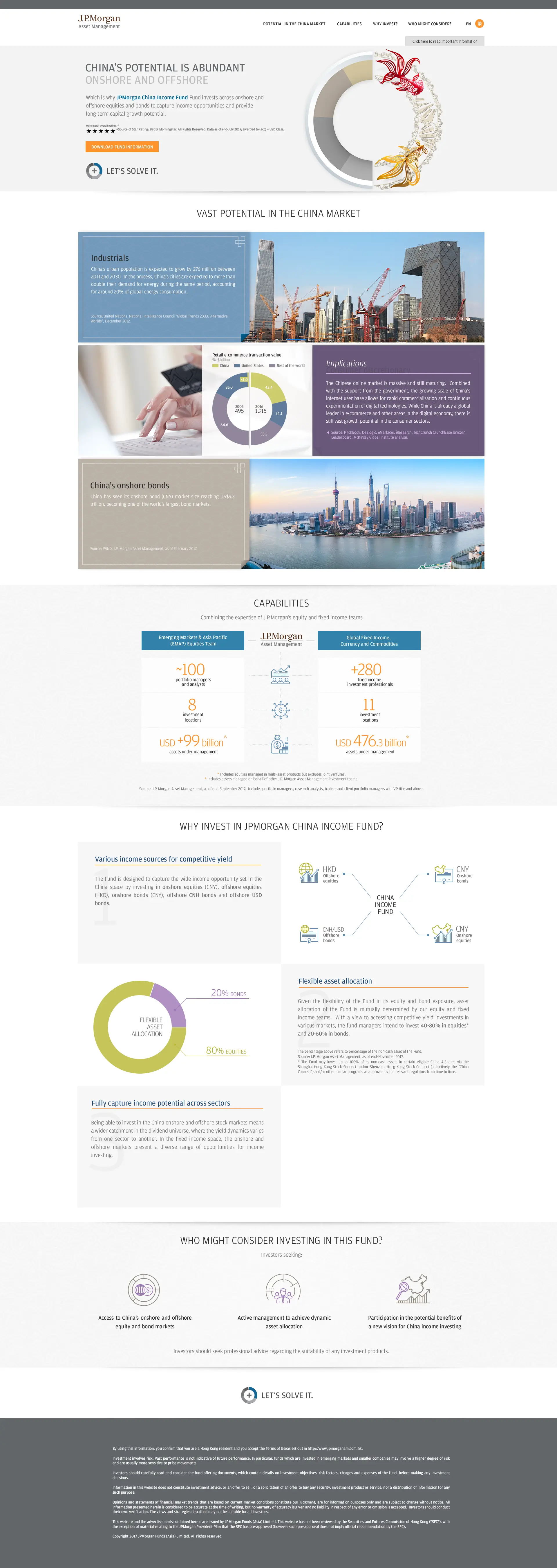
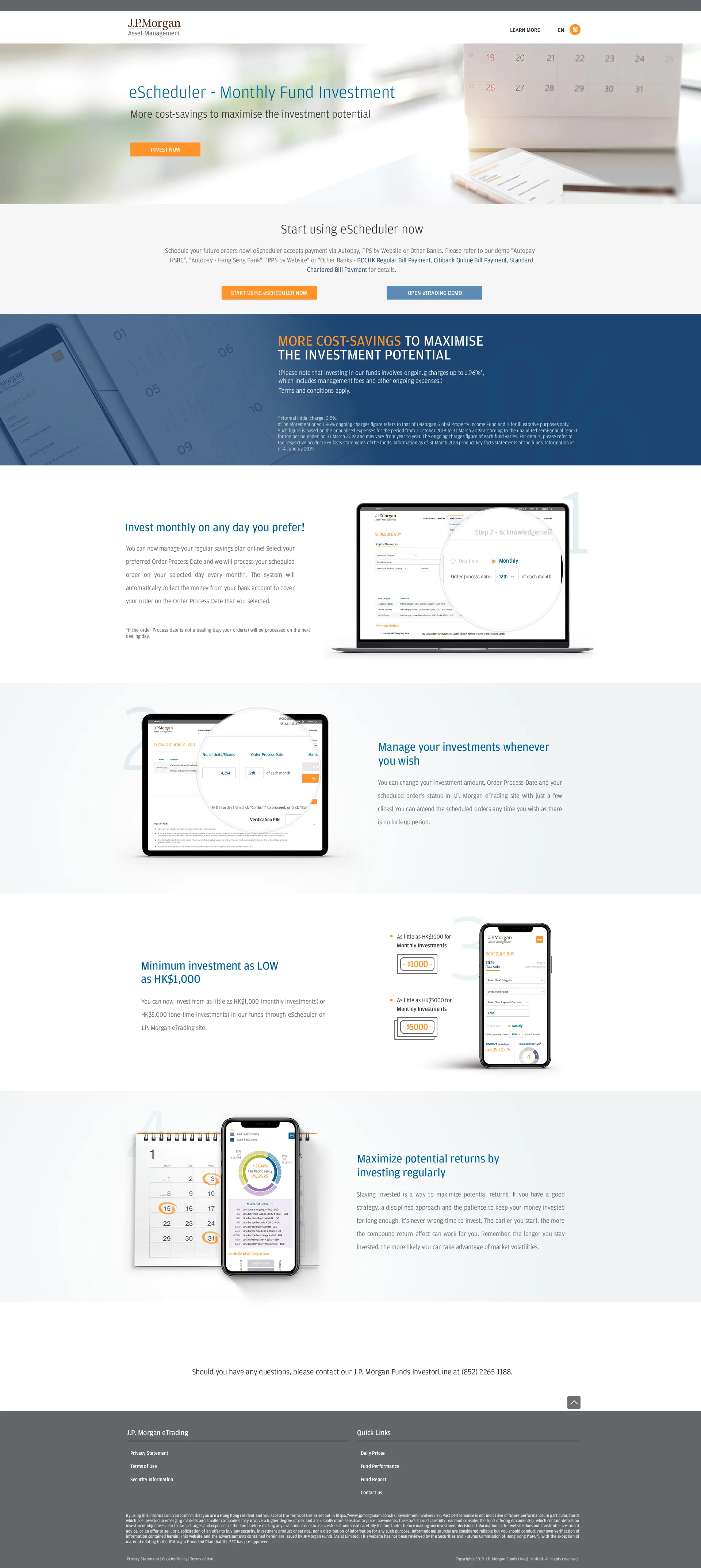
All ads funneled users to your main website, lacking division for your products and services.
Underperforming marketing campaigns
Insufficient retail distribution
Getting stuck in your marketing efforts
Lacking the necessary IT expertise internally
Better UI & UX experience resulting in bigger website traffic and longer watch-time of your marketing content
Increased sales
Marketing materials for ads with IT support
Increased brand awareness
Analysis for you marketing campaigns
Better understanding of your prospects